Our design office is always giddy with excitement when Apple releases a new product. When the company announced its release of the Apple Watch, we knew we’d have to both adapt our work accordingly as well as scheme together new ideas for innovative watch design.
Here’s what we learned about the Apple Watch:
Simplicity
The Apple Watch displays what’s most important. It aims to give the valuable basics at a glance. This is something graphic designers should keep in mind when creating a product for the Apple Watch. It’s easy for an app to get cluttered with massive amounts of info. Stand up to the temptation and avoid trying to display everything at once. Keep it clean and beautiful, your users will thank you.
One way that Apple is keeping things simple is by differentiating between glances, short looks, and long looks.
Glance
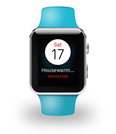
These notifications are designed to give important data quickly. When creating glance messages, focus on displaying the information first and building the design around it.
Is it time for a meeting? There’s a glance for that.
Short Look Notifications
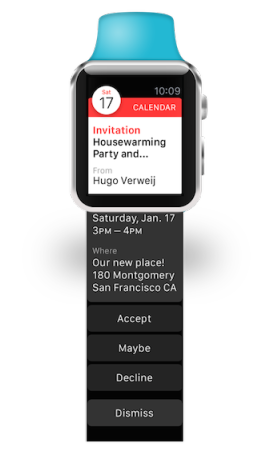
When first receiving a notification, the watch will display a “short look” view. This is a non-scrolling interface that cannot be customized. If the user looks at the notification long enough, the short look will transition into a long look view.
 Long Look Notifications
Once a long look appears, it becomes scrollable. The user is given more information and is provided appropriate actions for the notification given. There is little design involved in this function, but the banner is customizable to fit an app’s color scheme and brand.
Keep Those Point and Pixel Sizes in Check
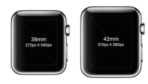
The Apple Watch screen is a lot smaller than anything we’ve designed for in the past. The sizes range from the smaller 38mm watch with a screen of 272 x 340 px to the larger 42mm 312 x 390 px.
When you’re working in Photoshop, it’s easy to get caught up in the look and forget the screen you’re working on can fit on a wrist. Make sure your images and text are easy to read and provide value to the user. Your dad will probably ask for one on Father’s Day, make sure he can read it.

Know Your Tools
New products don’t have to be intimidating. By finding the right tools, designing for the Apple Watch will be a fun experience. Here are some of our favorites:
Adobe CC Photoshop
This is obviously not a new tool for an app designer, but when an Adobe update came out with an Apple Watch preset, we all breathed a sigh of relief. Instead of spending time searching for a diagram to show you the right screen dimensions, simply use the tools you have in front of you.
The beauty of designing for the Apple Watch is it only requires 2x images. This makes saving out a design quick and easy. No scaling down happening here.
UI Kits
There are plenty of designers on Dribbble who have created their own Apple Watch UI Kits. UI Kits can be helpful and inspiring when you need to make a quick mock up. Download one you like or create your own!
The Apple Watch has transformed the way we view UX/UI design. With a sleek, small view users can see the important things at a glance. As designers for Metova, we’re excited to create for the new trend of wearables on the rise.


