Give a technician the same 33 questions on every visit and most of them won't apply. They learn to tap through on autopilot. Sooner or later, the row they tap past is the safety check. That's a design problem, not a training one, and FieldOps is designed around it.
One form for every job
FieldOps is a concept app we designed for technicians who install home EV chargers. The screens are a design study, not a running build.
In the form we started from, every visit gets the same 33 questions across four screens. A new home with room on the electrical panel gets exactly what an older house with a nearly full one gets. Most of it doesn't apply.
The technician is in someone else's garage, one hand on the phone, the other on the job. Each row that doesn't apply still gets read, ruled out and tapped past. Designers call that cognitive load. The homeowner just sees a slow visit.
The question that matters most, whether the panel can take a charger's extra load, sits on page 3, styled like every row around it. Don Norman wrote that human error is usually a result of poor design. Page 3 is a textbook case.
Let the software do the sorting
AI-first UX/UI design starts from one rule: the software adapts, so the person doesn't have to. FieldOps reads what it knows about the job, then asks only what this visit needs.
On a routine job, a new home with room on the panel, that's four questions. Four taps, no scrolling, phone back in a pocket.
What happens in an older home
- The technician enters the panel size. It comes first because it shapes the rest.
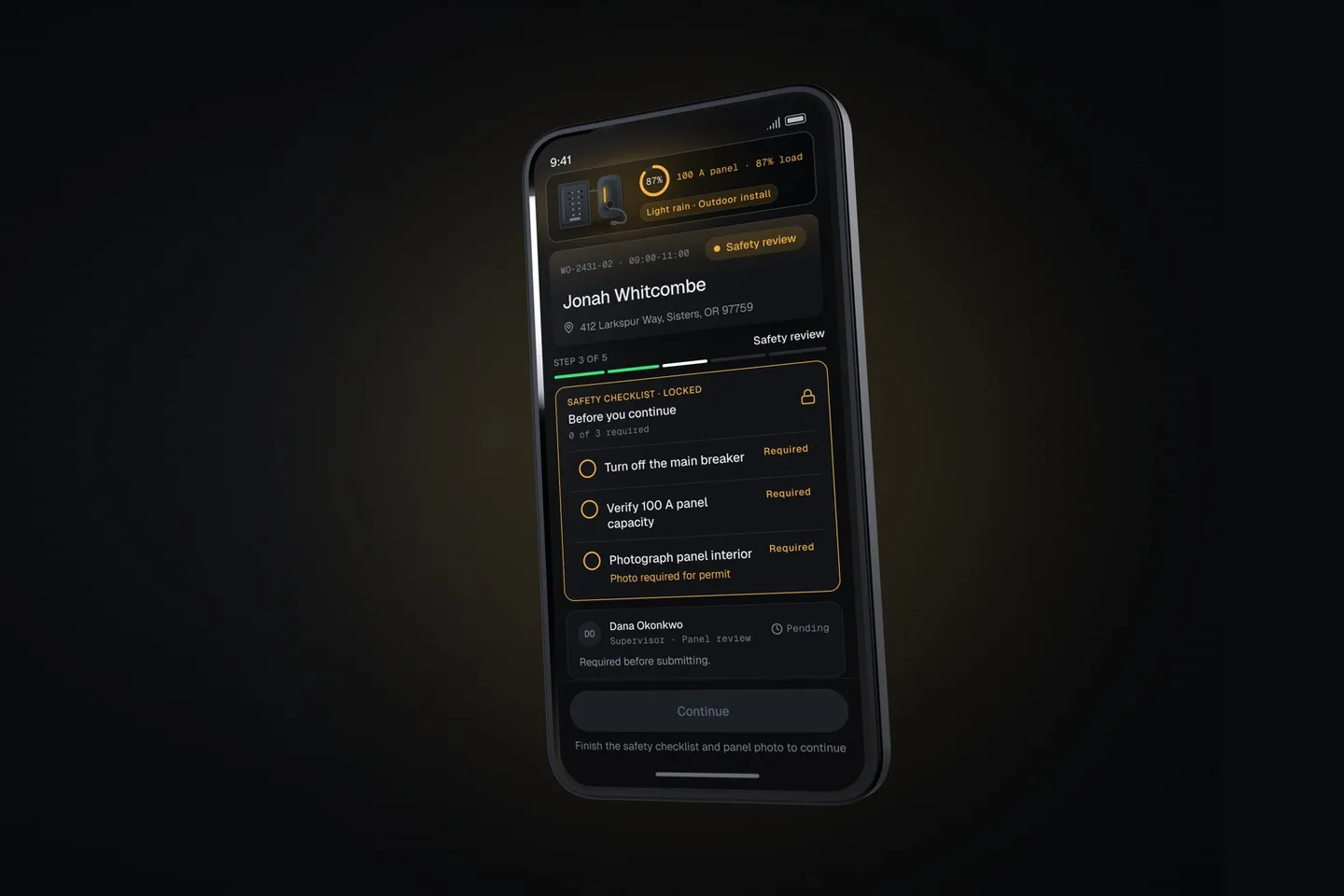
- The app sees the panel is nearly full. A charger could overload it, so the screen shifts to amber before anyone has to notice.
- Safety moves to the top, and locks. The checklist from page 3 is now first, and nothing else opens until it's done.
- A supervisor is asked to approve. The app sends the request, so the technician doesn't have to decide whether it's worth a call.
This job isn't really shorter. It gains a step the old form never had. What changed is order: the question that could hurt someone comes first, and can't be tapped past.
The routine job gets less to do. The risky job gets less to hunt for, and one thing it can't skip.
Old principles, applied per job
None of this is new. Progressive disclosure says show what this moment needs and hold back the rest. That's the routine job. Error prevention, the fifth of Nielsen's usability heuristics, says the best designs prevent problems from occurring in the first place. That's the lock.
The hard part was always the sorting. With one form for everyone, the technician did it, visit after visit. AI can make that call per job, in the moment.
The rule we held to: the adaptation changes what's on the screen, never how the screen works. Layout, buttons and navigation stay where the technician expects them.
A person still approves the risk
In the concept, the AI shapes the screen, but a supervisor signs off on the panel before the lock opens.
Any model can be wrong. It can be built to return only a clean answer, routine or needs care, but a clean answer isn't always a correct one. A false alarm costs a few extra questions and a supervisor's minute. Missing a nearly full panel costs far more. So we'd tune the model to lean toward needs care, and keep a person on every job it flags.
We spent the most time on how the approval feels. It arrives as a quiet notification, and the amber settles back to green. The feeling we wanted was that someone has your back, not that someone is watching.
If you build this for real, track both kinds of miss before and after launch, above all the risky jobs called routine. It's the same discipline that keeps LLM features from rotting.
Adapting only works if it's fast
If the screen waits, the design fails. Jakob Nielsen's 1993 summary of response times puts the limit at about one second: past that, a person's flow of thought is interrupted.
FieldOps needs one choice from a short list, routine or needs care, not a paragraph written word by word. That's work for a model built for fast, structured decisions. In the concept, that model is Jev, made by TypeSafe AI.
In Ariful Islam's independent test of 400 decisions (dev.to, September 2026), Jev's median was about half a second. Three mid-tier chat models took about 2 to 3.5 seconds. At list prices, a million decisions would cost about $8 against $240 to $500. It isn't a Metova benchmark, and it tested support tickets, not field service, so treat it as a direction. Half a second isn't instant, which Nielsen puts at 0.1 seconds, but it is under the one-second line. None of the chat models were.
Our team calls this layer System 0, a term Chiriatti and colleagues proposed in Nature Human Behaviour (2024) for AI that takes on part of our thinking. TypeSafe calls Jev a "System One" model. Either way, the decision is made before the technician sees the screen.
Software that fits the person
If you lead a product team, start Monday. Pick the form your field team fills in most. Next to each question, write which jobs need it. Find the one that would hurt most if skipped, and check whether it looks like every other row. If it does, that's your first fix, and it doesn't need a model.
The model comes in when the sorting has to happen per job, in real time. Then response time becomes a design constraint, one more reason engineers belong in the discovery room. Prototype one job type first, and ship it to answer one question: do technicians still tap past the safety check?
In a stranger's garage, with one hand free, software that fits the person asks for what the job needs, then gets out of the way.
Four questions when that's all the job needs. A lock when it needs more. A person on the call that matters.

Gadiel Alcántar is a UI/UX designer at Metova, designing the screens people use on the job, often standing up, with one hand free and a customer waiting.