The majority of changes announced at the Fall Apple Event won’t affect current apps. There is one change, though, that you should be aware of if you have an iOS app- a new screen resolution.
iPhone X Updates
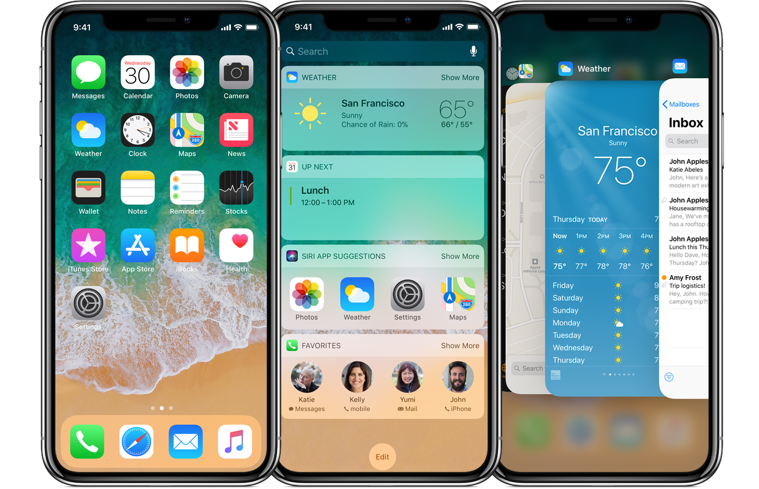
The iPhone X has a 5.8-inch OLED True Tone display with 2436 x 1125 resolution. It has the same width of iPhone 6, iPhone 7, and iPhone 8. The physical home button has been removed, which frees up quite a bit of vertical space.
What Might Happen to Your Design?
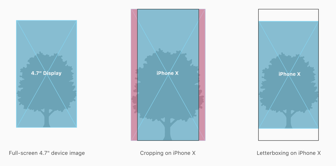
So what is hiding down there “under” the home button on your app? How will your mobile application handle the extended visual real estate? Will it be letterboxed like an old movie or stretched to fit, throwing off all proportions? Maybe your app will gracefully accept the new dimensions and adjust accordingly.

Image Credit: Apple
How Will Your Design React?
What will your app do? It depends. If your developer built the app by placing assets in relation to the edges of the screen, you may be in good shape. If a asset is supposed to be 10% away from the top of the screen, it doesn’t matter how long the screen is, it will always be 10% down.
A design whose assets depend on their relationship to each other or by pixels could be displayed in a way other than originally intended. Because the aspect ratio is different from previous iPhone versions, images may be stretched or shrunk or cropped to fit the screen.
The screen density has increased, making assets whose size is defined by pixels appear smaller on the iPhone X than other devices.

Image Credit: Apple
How Will Your iOS App Look?
The best way to find out how your app will look is to run it on a simulator. You can do that through Apple’s developer tools or have your mobile development partners do it for you. If you find that your application needs some updating to shine on iPhone X, contact us!
