In the realm of mobile and web design, the selection of colors is often a crucial starting point. There are many things to evaluate when deciding what colors to incorporate into your designs. Understanding the psychology of colors can be an effective tool.
Red
The color red encourages an appetite! You will often see red used in branding for food related companies. Red also creates a sense of urgency, excitement, and passion.
Blue
Blue is most often associated with a sense of peace and calm. It evokes a feeling of security and trust (which is important in many corporate brands). Blue has also been found to curb appetite and boost productivity.
Purple
Purple shades provide a sense of royalty and respect. Purple also boosts creativity. It is
typically used in brands that strive to appear regal or innovative.
 Green
Green
Green is seen as a tranquil color. This color is generally associated with health, relaxation, and nature. Variations of green have been found to promote decisiveness.
 Orange & Yellow
Both orange and yellow are high-energy colors! They both promote excitement and enthusiasm. However, use them with caution as too much yellow and orange have been found to cause anxiety.
 Black
Black
Black is often associated with strength, power, and stability. Brands that use black are seen as intelligent. As with orange and yellow, it is important to not use too much in your designs. Large amounts of black can feel overwhelming.
 Grey
Grey
Grey represents practicality and solidarity. While touches of grey are nice, too much grey evokes feelings of indecisiveness and depression.
 White
White
White often sparks a sense of creativity as it acts as a blank canvas! This color is often associated with feelings of purity and cleanliness.
Applying Color Knowledge
To illustrate the effectiveness of color influence in our work we can examine two projects: getRX and SEAS.
getRX
getRX for Patients allows a user to take control of their own prescriptions by allowing them to find pharmacies, receive prescriptions from doctors, and send prescriptions to pharmacies. The tone of this app needed to be energetic to entice users to take action while also remaining true to the tranquility and health aspect of a healthcare related app. In order to achieve this vibe we created an overall color scheme including a yellow orange and teal green. There are also touches of grey and white present.
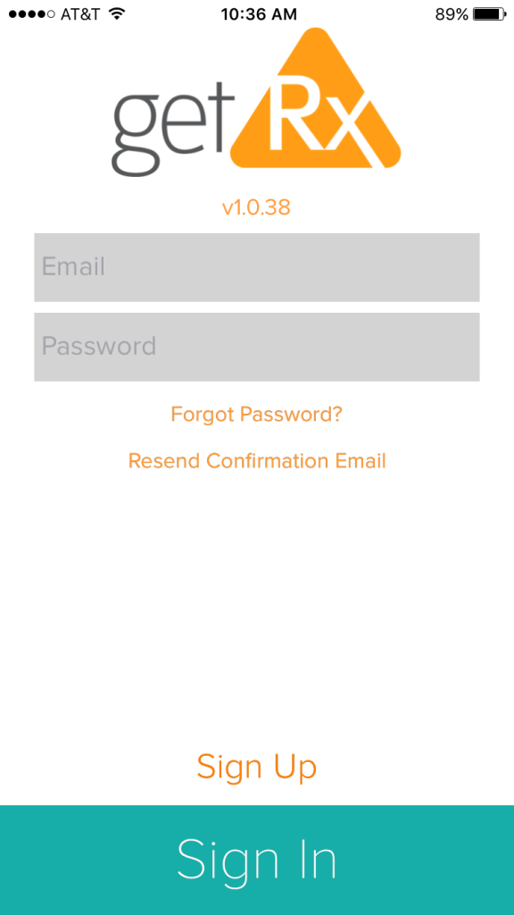
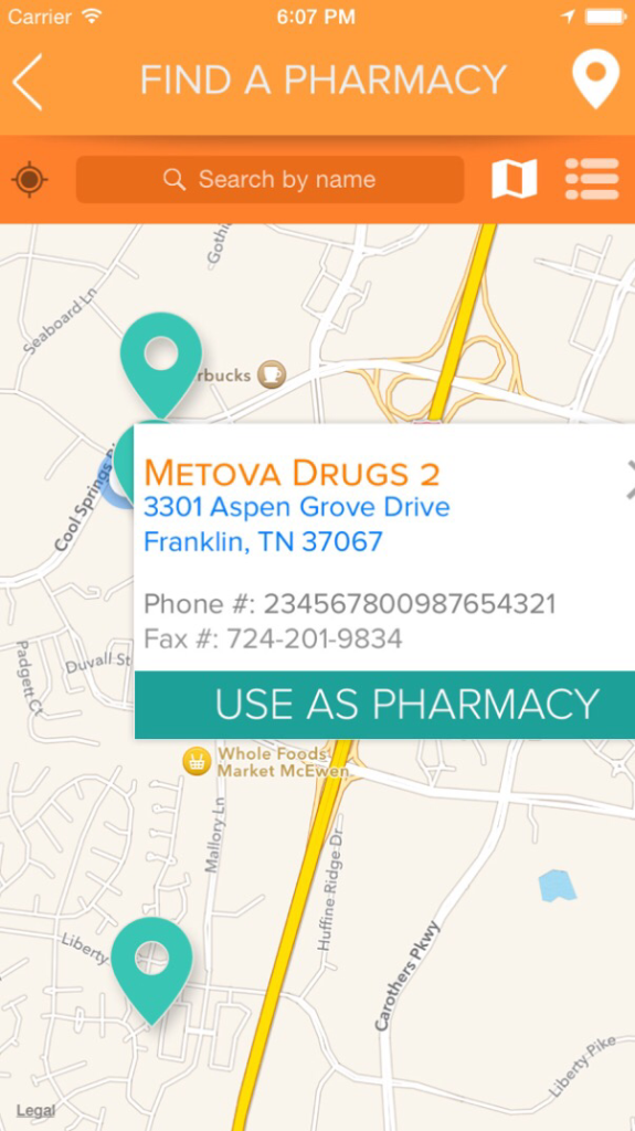
The yellow orange color promotes enthusiasm and makes users excited to utilize the app. The teal green is representative of the health and well-being aspect associated with prescription medication. The grey and white accents help keep the app clean and practical.
SEAS
SEAS is a company that provides software products and services designed to innovate problem solving in the education system. SEAS has recently been rebranded to stay true to their innovative and creative nature. SEAS’s new color theme is a mixture of blue and green hues with lots of white. There are also pops of red.
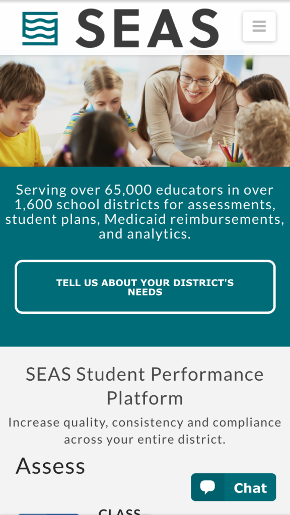

With a primarily white color scheme SEAS gives off a modern inventive feel appropriate for a technology company. The blues and greens keep everything peaceful. With red accents the company is able to show passion and excitement for what they do and their role in aiding educators.
Conclusion
Understanding the influence of colors on your audience can prove to be a helpful tool in all aspects of design. It is especially important when designing for a mobile or web brand since your product will reach a large audience. With a basic knowledge of color psychology, you can fine-tune your designs to represent exactly what your clients and users need.

 Green
Green Orange & Yellow
 Black
Black Grey
Grey White
White