
Android, iOS, BlackBerry and Windows Phone each provide specific tips in their development forums about how to make your custom applications look and feel as though they belong on that device.
These guidelines on everything from icons, shadows and gradients, to layers, sizes and stroke weights are helpful, and can keep your design from becoming a Frankenstein design of apps. However, companies looking for a custom application design should also be encouraged to veer away from best practices, at times.
When designed properly, small changes to a mobile application’s arrows, down buttons and corners will help give the app a richer experience. So the next time you think, we want our app to be different but we still want it to feel like an Android app or an iOS app, keep these tips in mind.

1. Maintain theme and functionality while making an area unique. An app’s menu needs to be functional and easily accessible, but it’s also a place where you can make your app unique.
For example, a custom tab bar works well for menus with three to four options. If your app holds a lot of information, it may require a sliding menu. Symple, an app that tracks symptoms and health, provides a good example of a unique tab bar menu.
2. Reinforce your theme through imagery. Enhance your theme and user experience by incorporating imagery in a list view, like the Eataly app does. This makes the screen more dynamic and engaging and also allows the user to scan the screen quicker to find what they’re looking for.
3. Integrate headers to extend design and enhance functionality. Incorporate other elements into your header design to achieve a unified look. For example, the Jet Lag app connects tabs to the header for a look that is well thought-out while allowing the rest of the screen to breathe.

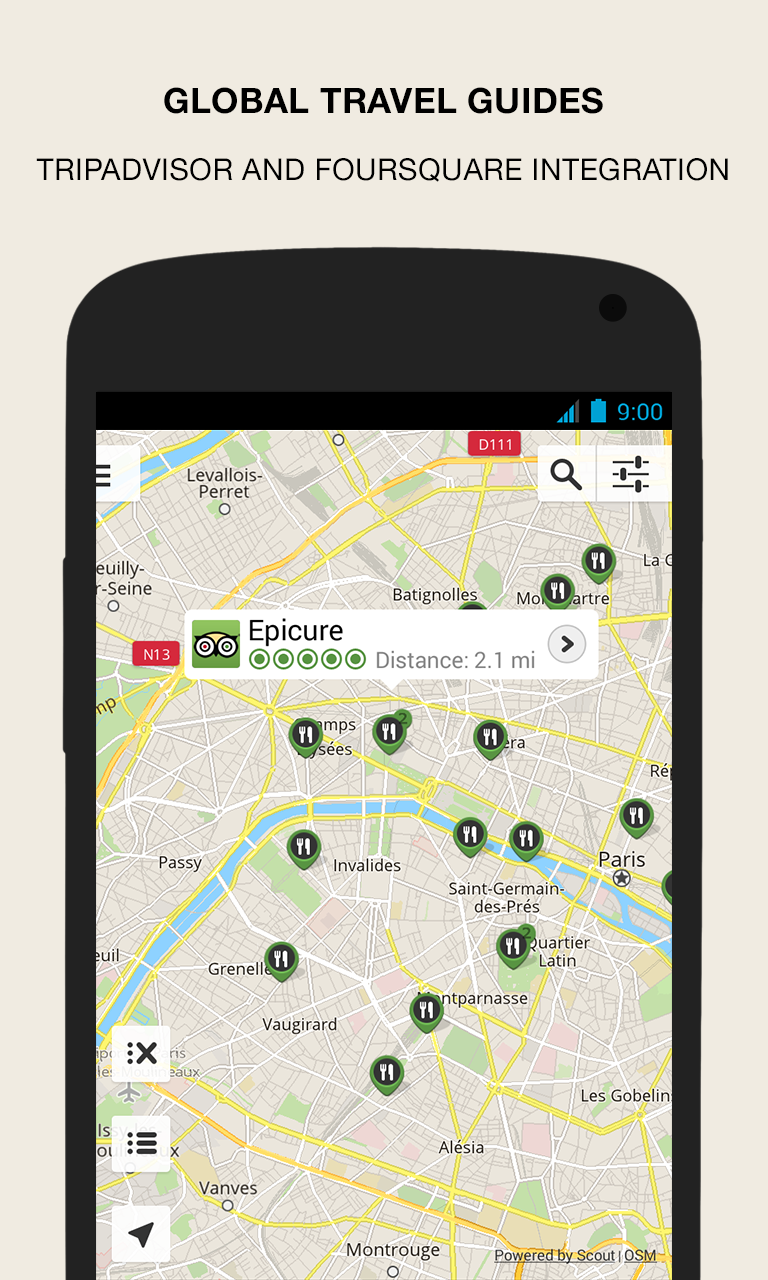
4. Match your search bar. Just because your screen needs a search bar doesn’t mean it has to be an eye sore to a beautiful design. Try matching the search bar to the background so it blends in but still stands out for easy usability. iBooks does a great job of this.
5. Utilize the side of the screen. On some platforms, screens are getting a bit wider these days, so why not challenge the standard and use a side navigation? Placing tabs on the side of the screen allows content with long lists to utilize the length of the screen. The Android GPS Navigation & Maps app uses this technique. This is a great idea in the right situation.

6. Keep it simple. Some custom applications are best in their simplest form. These include apps that do not have a large navigation or flow. When you come across an app in this situation, take time to make it visually appealing and relevant across any platform. For example, while many weather apps clutter their interface with tons of details that aren’t all that useful, Conditions for iOS goes the simple and beautiful route.
7. Use shapes. Who says everything has to be text on a horizontal bar? Everyone knows how a list works and once they tap an item they will move on to more information about it, so don’t be afraid to spice up elements on a list.
For example, we built the WESCO Data Center App that they use for distribution. The app is divided into categories like “data center solutions,” “location finder,” “news & amusement” and “settings.” This information is neatly displayed using a menu wheel. It’s a clean way to make a menu more interesting and more fun to use on a day-to-day basis.
8. Break the grid. Keep users engaged by placing images in way you normally don’t see on a smart phone. The Design Observer app does just this.

9. Incorporate branding. One key element to making your app look consistent across platforms is strictly adhering to your company’s branding standards. Carrying your logo and other stylistic branding traits—whether it’s a specific font or color combination—ensures a consistent look and feel throughout multiple platforms. Updated for iOS 7, this LinkedIn app maintains the feel of the popular professional network website.

10. Follow through. Designing unique features provides a great impact on the look of the app as long as you follow through. It is more harmful than helpful to only customize half of the features your app may use if you’re going to let other conventions slip back in that do not match the cohesiveness of your design. For example, if you design a custom highlight as you scroll, make sure it matches the list’s select button as well. I Do Lists app uses red as its custom color.
Although the design of your custom app holds a lot of weight, it doesn’t matter what it looks like if functionality isn’t a priority.