


Expertise
AI / Machine Learning
Production-grade ML, training pipelines, evaluation harnesses, deployment, and drift monitoring. Not notebooks that get handed off.
- TensorFlow
- PyTorch
- Hugging Face
- scikit-learn
We work with market leaders across industries, delivering apps, websites, and hardware connected systems for over 20 years.
Built for those who lead.
Since 2006, we've delivered 250M+ downloads and $1B+ in client revenue. We work with industry leaders to create intuitive, secure, scalable products.
From start-to-end of the project, we combine your insight and feedback with our business and technical expertise to help your product win.
Strategy, design, development, QA, and marketing, all under one roof. One team that understands every aspect of your product.
Working prototypes in 2-4 weeks. AI-accelerated development workflows that help deliver software faster while maintaining architectural quality.
From SiriusXM to TruGreen, our products serve millions of users daily. We conceptualize and improve your product with your business growth and success in mind.
Metrics-based production and prediction paired with incremental delivery, provide insight into the project's delivery timeline and project status so there are no surprises.
Whether introducing a new product, scaling for growth, maintaining maturity, or navigating change, Metova provides the expertise and resources to ensure success at every phase.
Strategic and Technical roadmapping to ensure the technology supports your vision.
Validate your ideas and move forward with confidence with a fast turn-around that lets you test your product before full commitment.
Full-stack web and mobile applications built to scale across iOS, Android and enterprise platforms.
Human-centered design for complex products. Research-driven interfaces that users love.
Ongoing support, maintenance, and optimization so your product stays secure, stable, and competitive.
Connected devices, fleet management, FinTech Solutions, and embedded systems engineering.
Custom AI/ML solutions, LLM integrations, intelligent automation, and AI-powered SaaS platforms.
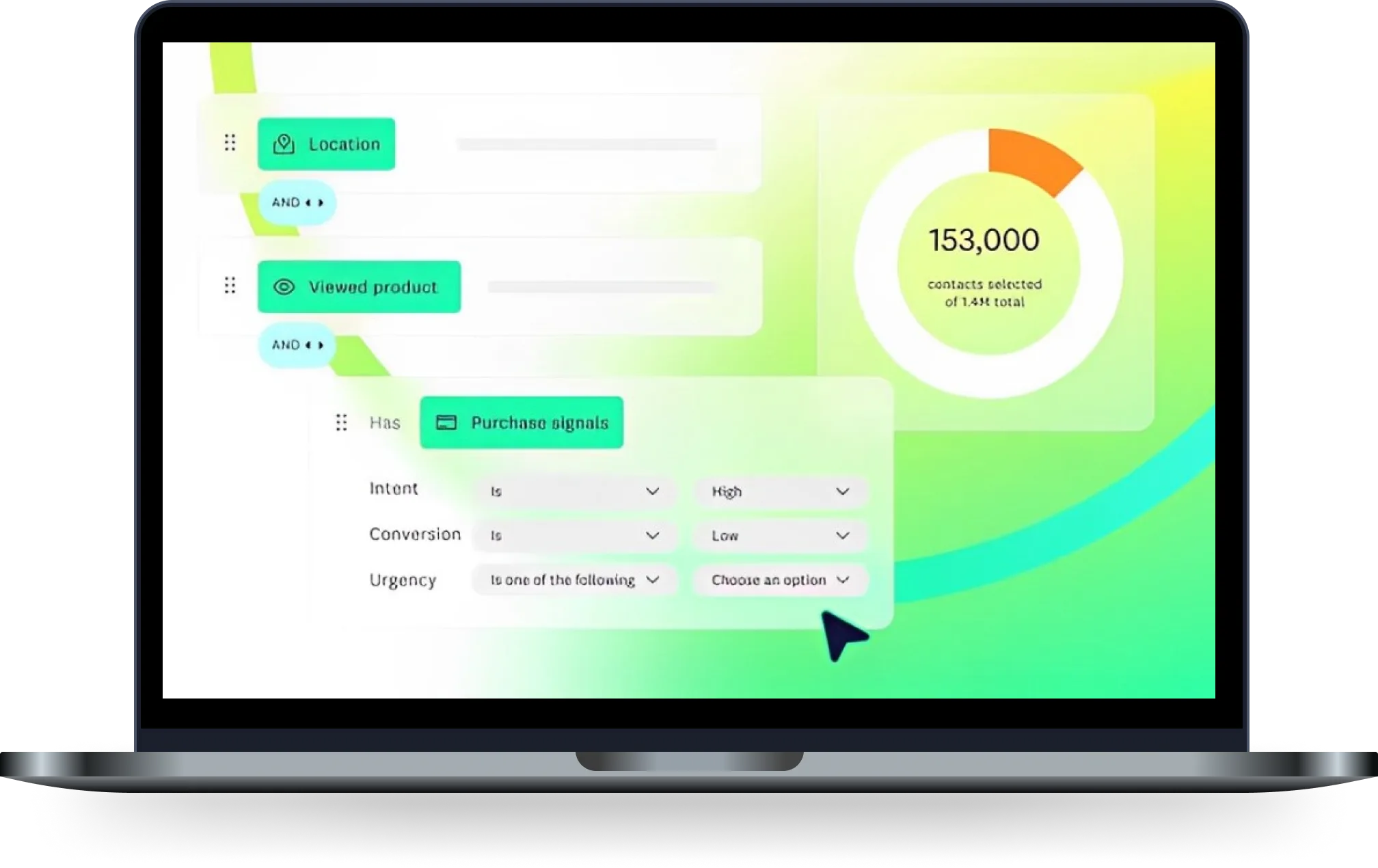
Cut Azure hosting costs by 50% while scaling to millions of active users through intelligent infrastructure optimization.
View Case Study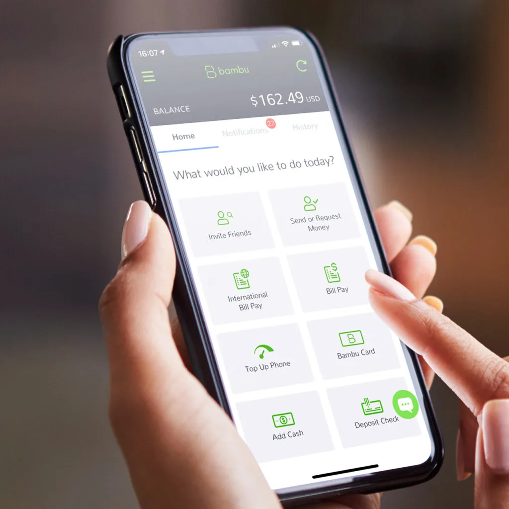
Built a neobanking platform for underserved communities with real-time payments, virtual cards, and bilingual support.
View Case Study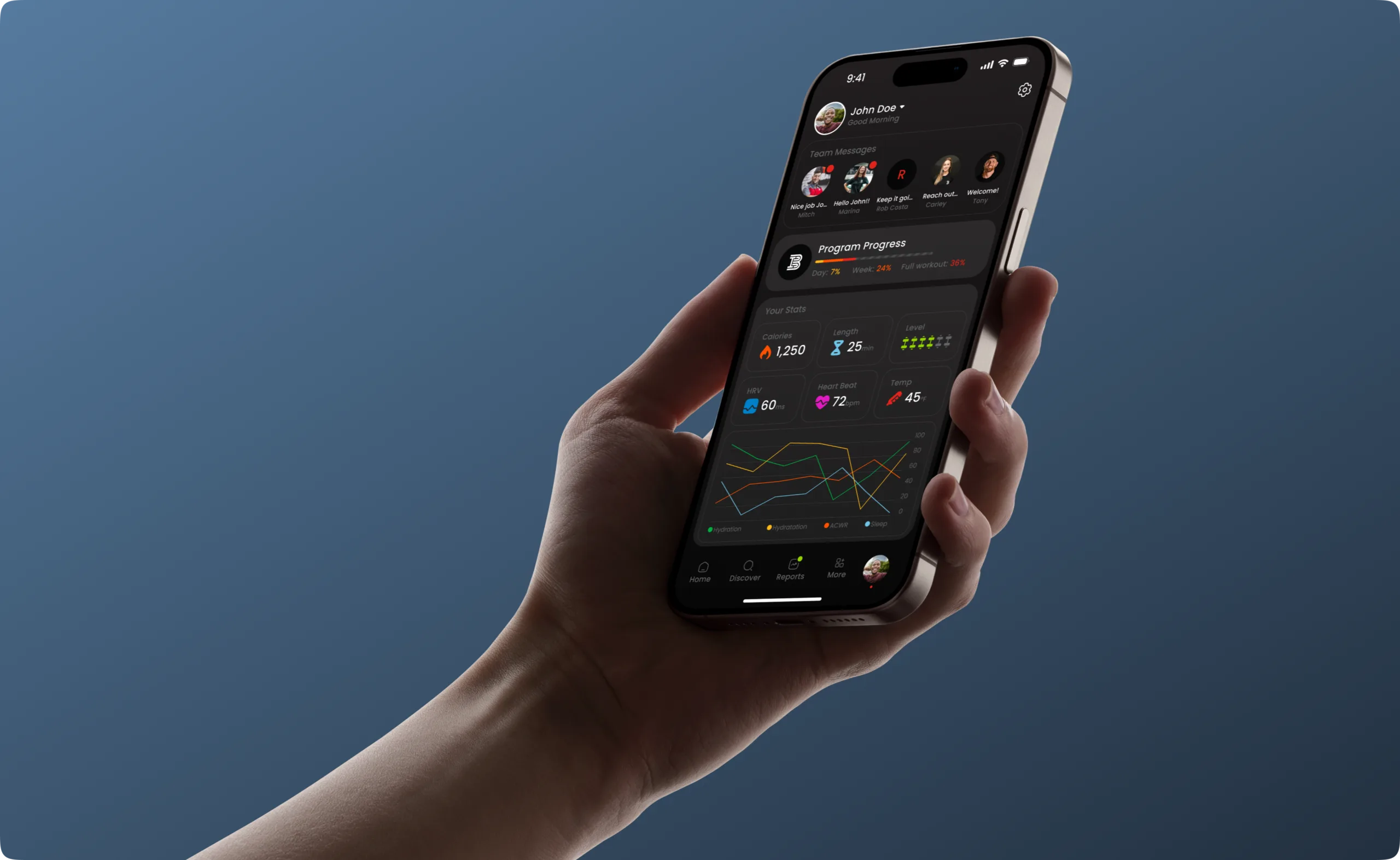
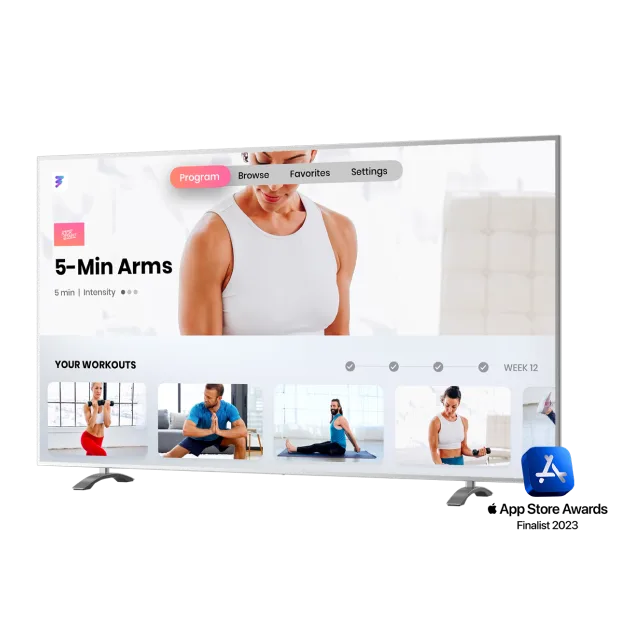
Designed and developed a performance training platform connecting elite athletes with data-driven workout programs.
View Case StudyProduction-grade ML, training pipelines, evaluation harnesses, deployment, and drift monitoring. Not notebooks that get handed off.
Claude, Gemini, and open-source models wired into products with RAG, guardrails, and cost controls that keep them reliable at scale.
Native iOS apps written in modern Swift and SwiftUI, clean architecture, accessibility baked in, deep platform integrations.
Kotlin-first Android apps built with Jetpack Compose, tuned for performance and reliability across a fragmented device ecosystem.
Full-stack web and cross-platform mobile on React, Next.js, React Native, and TypeScript, same language, shared logic.
Cloud systems engineered for uptime, AWS, Azure, GCP, Kubernetes, with the observability and DevOps layer that keeps them running.
Firmware, fleet management platforms, and embedded systems for connected devices that communicate reliably at scale.
Data pipelines, warehouses, and caching layers engineered for products with millions of users and tight latency budgets.
"Metova delivered beyond our expectations. Their team understood our vision and built a product that has transformed how we serve our clients. The technical expertise and commitment to quality are unmatched."
From regulated industries to consumer platforms, Metova brings the expertise, process, and accountability to take your product from idea to impact.