There are so very many details that go into every piece of media you consume. As I write the copy for this article, I know that the words aren’t the sum of your impression of this blog. What you read may be what you remember the most, but subconsciously there is much more going on to affect your impression that you may not even realize. Working with and around the design team at Metova has given me new insights into what makes an article actually look the part.
Give your Content Room to Breathe

If your article is difficult to read, it won’t matter what you write. Just like if you were to create a contact form, conversion funnel, or landing page, you want to make the task appear as easy as possible. One way to do this is through added padding, or space. Giving images, paragraphs, charts, and other elements additional space makes content more digestible. It can also help divide the article into sections, making it easier to skim.
Line ‘Em Up
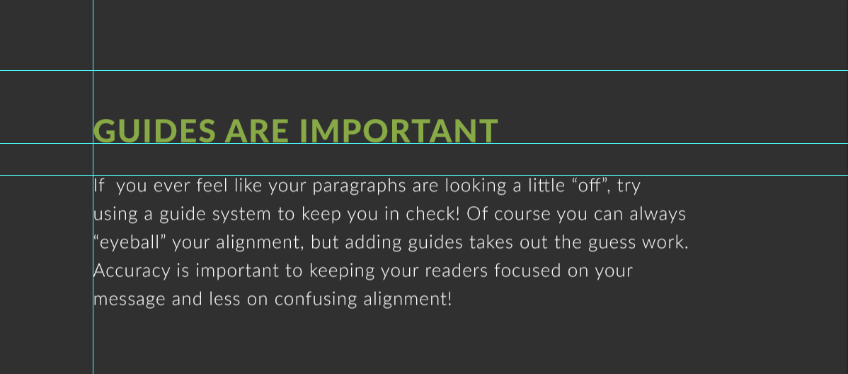
Paying attention to how your assets are aligned goes hand-in-hand with padding to keep your content looking clean and readable. I think of it like a newspaper or gridded drag and drop template. If you were to drop an image or paragraph into this sort of template, how would it look? The edges would all align so that if you were to draw evenly spaced vertical or horizontal lines across the screen, the assets would completely fill at least one. It is pleasing to look at. If you can’t quite figure it out, try drawing lines and prototype on paper, using an online tool, or tuning in to the most fastidious version of yourself and take another look.
Use a Grown-Up Font

If you want to be at all taken seriously by a designer, don’t use Comic Sans. I know you are thinking, “…but it’s so friendly-looking and when I use it, my papers are a tiny bit longer.” So why the extensive bias? After doing some research, it appears that one reason why it is held with such disdain may actually be caused by its very round curves that give it its friendly appearance. Some designers feel that this causes several of its letters to look a bit too similar, which makes it hard to read. If you keep an eye out, you will find it is everywhere. There are hundreds and thousands of font choices available and selecting Comic Sans is like telling the world you ordered the grilled cheese sandwich at a steakhouse.
Quality Photos

Images give your article interest and help break up the text. Choosing the right image can turn your article from amateurish to knowledgeable. While definitely not a steadfast rule, I found that most of the best-looking images don’t include people. Yes, I know, people are drawn to other pictures of people. This is both the benefit and challenge of finding the perfect image. I want people to look personable and the situation real. Most of the time, images of strangers don’t do that for me. Stock photos are posed and look forced. Images of places or things are more relatable.
Changing where I searched for images has also helped a great deal in making media feel more mature. I primarily do most of my image searching on Pexels, Pixabay, and Unsplash. I try to avoid more user-submitted potpourri sites like Flickr. When I do search out in the wild, I look for images that wouldn’t look out of place in the sponsored images sections of Pixabay or Pexels.
Try It Out
Publishing a stunning article involves more than just writing a couple pages of text. Picking up just a few design principles and ideas can greatly improve the look and feel of your blog. Take a good look at your next article before you publish it. Does it feel like a big wall of text? Add some padding between paragraphs and images. Are your images all over the place, giving it an unstable vibe? Imagine grid lines and line those suckers up. Is the font difficult to read or not portraying the right feeling? Change it – but not to Comic Sans! Do your images feel forced or unfamiliar? Find several new ones and switch them out until you have a more comfortable combination. If you have a design team, reach out to them! Getting feedback from a professional is a wonderful way to learn. Hopefully these simple tips will help you turn your blogs from amateur to expert.