With the announcement of the new iPhone X adding another aspect ratio to the iPhone squad, I found that I didn’t fully understand some of the design vocabulary that was being used. As I have done with many topics that I had trouble wrapping my mind around, such as ADA compliance and cryptography, I wrote about it. If you have found yourself struggling to comprehend some basic design concepts, these common design vocabulary explanations will help.

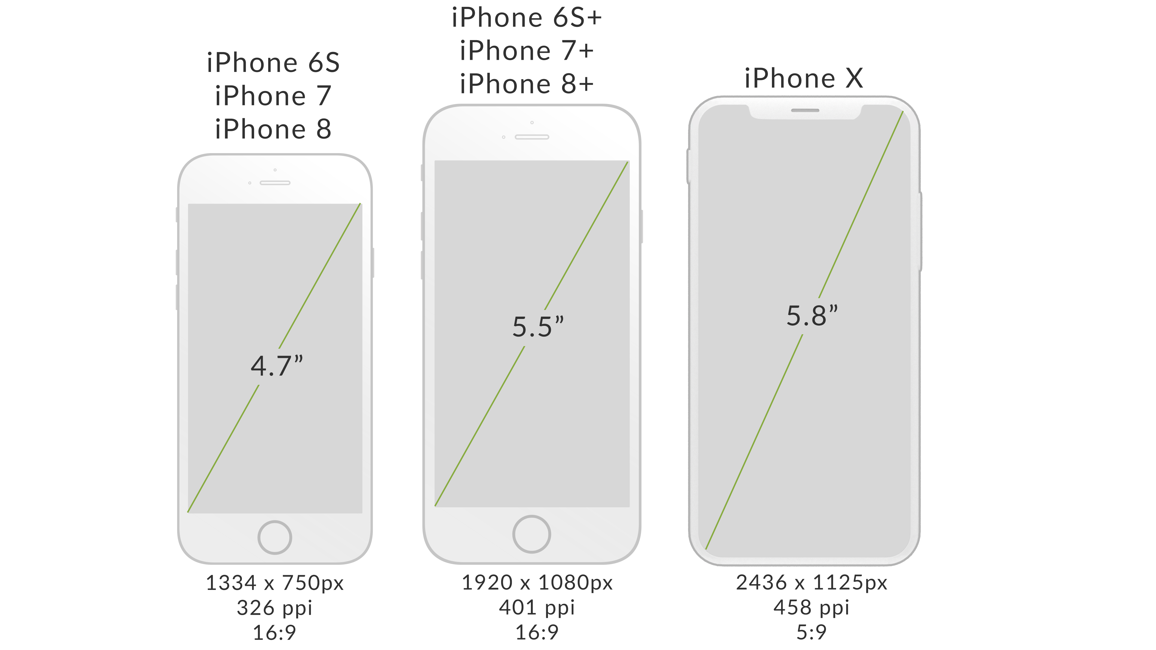
Screen sizes, resolutions, pixels, and aspect ratios for iPhones
Screen Size
The physical dimensions of a screen. Similar to how TVs and monitors are measured, it is the length, in inches, of the screen from one corner to the diagonal corner.
Pixels
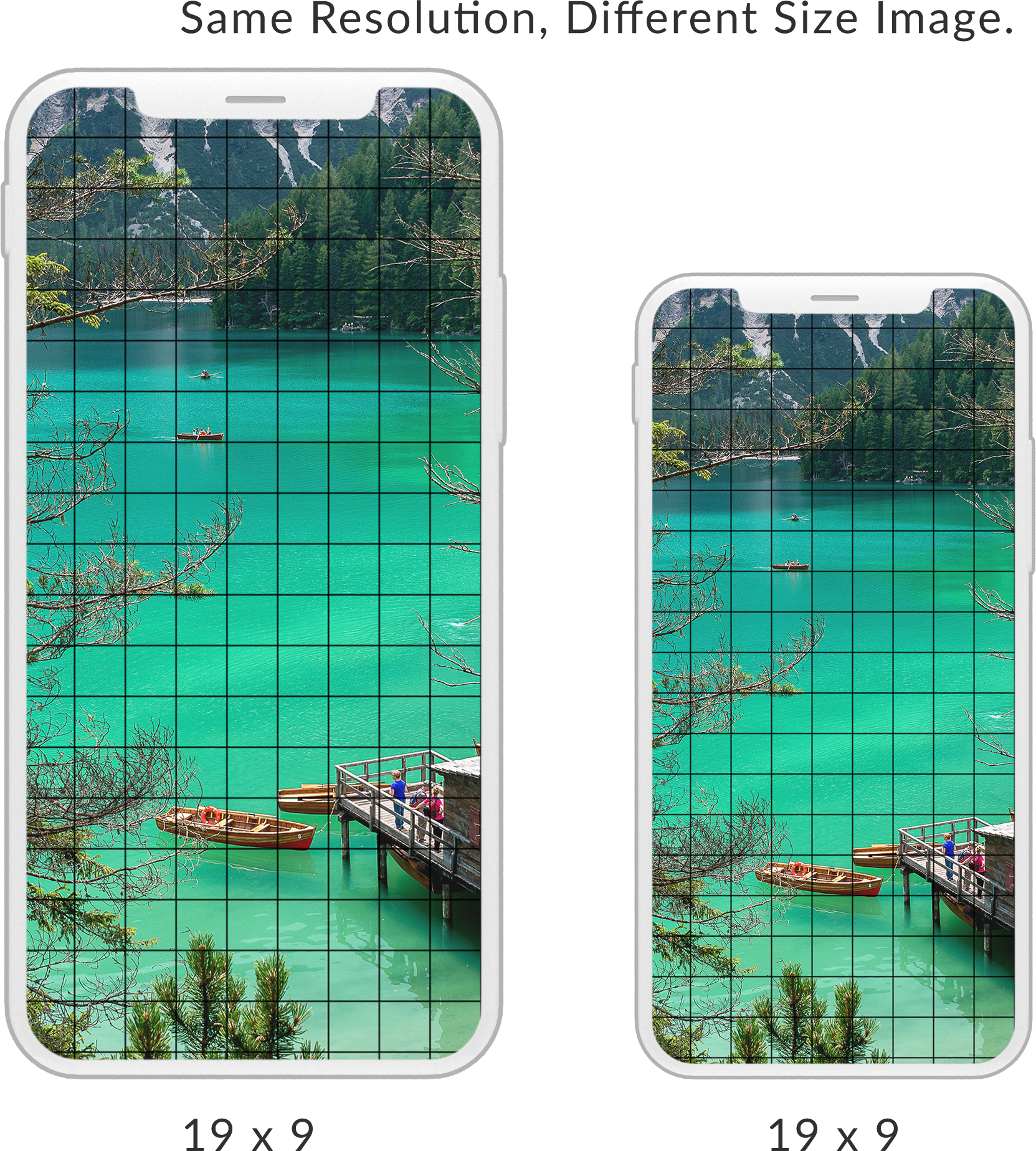
Screens display images through pixels. A pixel is a dot that can be manipulated. They are like building blocks; many are needed to build an image. If you colored in the squares on a piece of graph paper to create an image, each of those squares would be like a pixel. Pixels are not always the same size from device to device.
Let’s say you have an drawing on a normal sheet of paper that you want to duplicate on a wall. Imagine adding a grid overlay of 10 boxes by 10 boxes, creating a 10×10 grid on the new space and then transferring the image, box by box to the wall. You would have the same number of pixels and the same image, just the pixels are a larger size.
Resolution
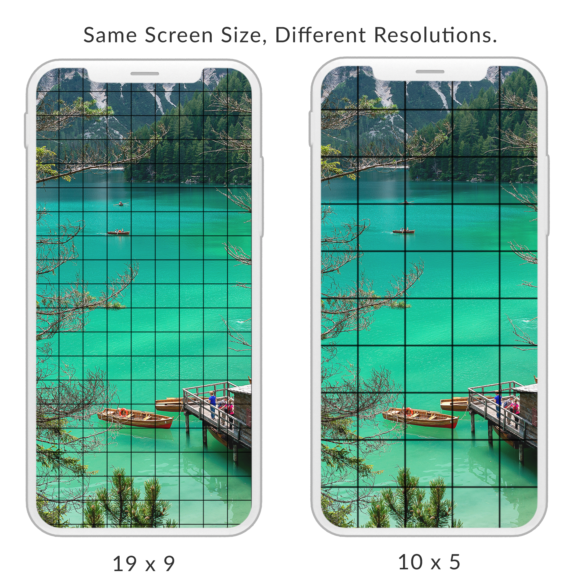
This is the number of pixels displayed on the screen. It is often formatted as width x height or pixels per inch. Because pixels aren’t always the same size, it is possible to have two devices with the same screen size and different resolutions. The higher the resolution, the higher the image quality and more detail included in the image.
Aspect Ratio

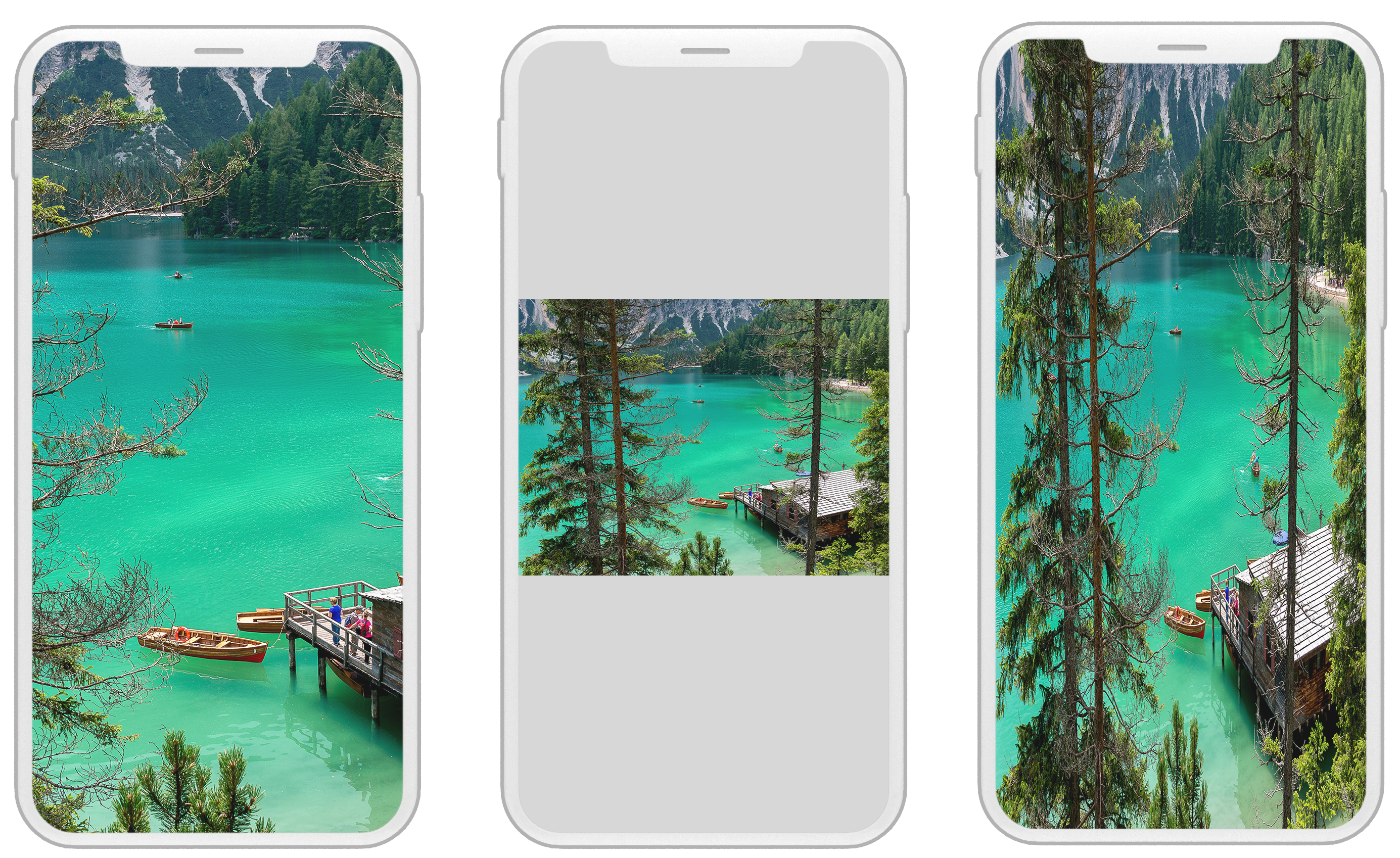
What proportion is the screen’s width to height? Aspect ratio measures width to height and then reduces it, like you would a fraction. A 4 x 8 or 20 x 40 screen would both have resolutions of 1:2. This is important because an image that is 2:3 will not fit perfectly on a 1:2 screen. The edges would either extend beyond what is visible on the screen, have sections of the screen that aren’t covered by the image, or a stretched image.
Did this help you to understand design a bit more? Do you have other concepts you get stuck on? Let us know!


