Whether you know it or not, fonts are kind of a big deal. They are a work of art. Every great brand has put a lot of time and energy into deciding which typeface represents their namesake. It’s kind of crazy how much thought goes into something you barely notice, right? A designer will tell you otherwise. Typography is as vital to your brand as anything else. A decision on fonts can make or break the vibe you’re desiring for your audience. Here are a few tips to keep in mind.
Character
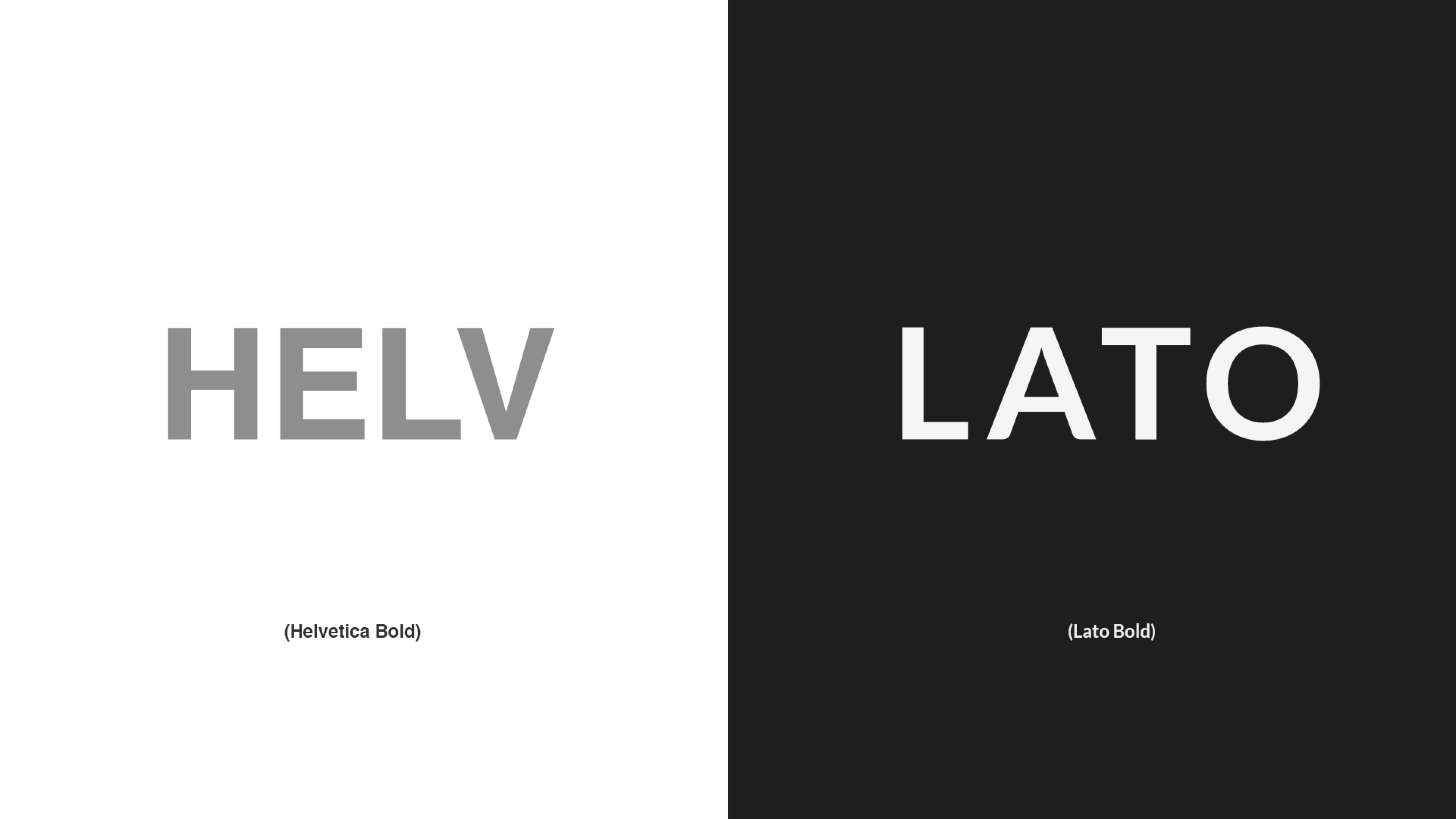
Typography allows your brand to speak in ways beyond words. Avoid using standard fonts that come preloaded on your computer. This can distract users from your message.
A great, unique font choice allows your customers to think, “This is beautiful!” instead of, “I’m pretty sure that’s Century Gothic. I know this because I used it on a paper in high school.”

Finding a font doesn’t have to be a daunting task. With the right resources, font discovery can be fun and affordable. For brands on a budget, we recommend Creative Market. Creative Market offers beautiful fonts, most of them within the $10-$30 range.
Variation and Variety

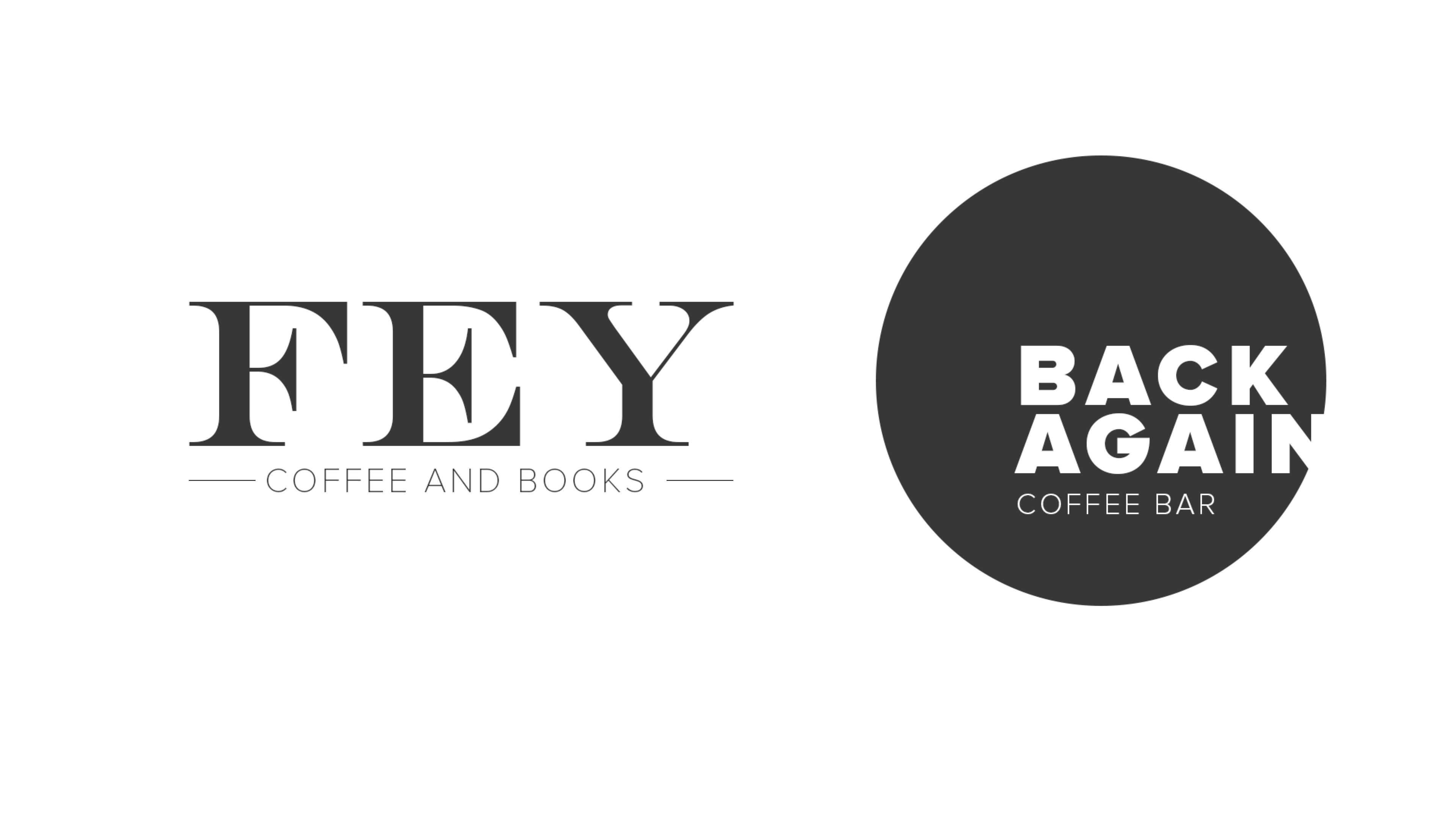
It’s true, you are allowed to have multiple fonts within your brand. However, they must work together. Mixing headers and paragraph fonts is a great way to add variety to your work without going overboard. Rule of thumb: opposites attract. Sans-serif fonts tend to balance out serif fonts, and bolder fonts can really liven up lighter fonts.
Take it Easy on the Web
Google Fonts and Typekit are fantastic resources that offer web-safe fonts. Web-safe fonts are easy to install and cut down on load time for your users across all browsers. This creates an awesome user experience and allows your designer to sleep peacefully at night knowing a beautiful font is displaying on your website. #Winning
Take an extra second the next time you look at an advertisement or brand. How does it make you feel to look at it? Now try to imagine it in an entirely different font. It likely has a different sense about it. Fonts make a difference so don’t take the decision lightly.


