
When people think about branding, they initially think of a logo, or about creating a logo. However, here’s the thing: branding is so much more than a logo. Your branding is how you interact with your customer and how your customer perceives your company. More importantly, it’s a large part of how you are going to get a consumer to buy into your company.
First impressions are everything. For instance, you can have a great product but if your branding is off or unattractive to the eye, you can immediately lose a customer before they even know what the product is or what service you provide. With so much at stake, your brand is vital to the life of your company.
Over the next few weeks we’ll be diving into the essential principles of branding – everything from your brand color palette, typography, social presence, company voice, and yes (obviously) your logo.
Color Palette
They say, “actions speak louder than words”, I would argue colors do the same. Color choice says a lot about your brand.
Each color has a feeling or visual meaning behind it. You’ll want to make sure you evoke the right emotion you want from your customers. For example, if you are in the health food industry you want to use colors that evoke the feeling of fresh, clean, delicious, and obviously healthy. So brand colors like green, yellow, blue, and perhaps even a few earth tones would be good choices.
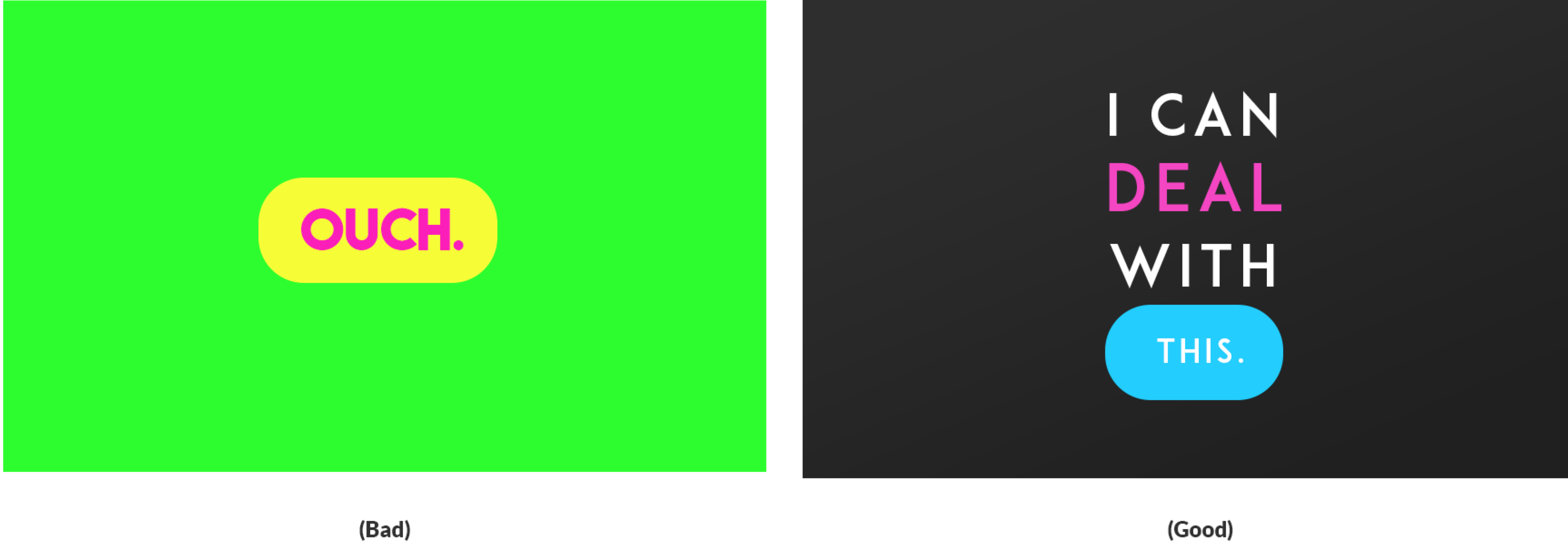
Use your Main Color Sparingly
Treat your main color like salt: too much can just ruin your dish. Use your main color more like an accent color, or to complement your goal.

The Trick with Light Colors
It’s always great to go minimal and clean, but if your main color in your brand color palette is very light, we would recommend not using it as an accent color for text and buttons.

Rainbows and Neons
Easy tiger, you can’t have it all. Your brand should be based around 2-3 colors. It helps with brand recognition for your consumers! You need to have an identity. Just pick a few colors and your customers will be happy.
Neon can be fun when used correctly, but you don’t want to cause an eye injury. If you are going to use neon, use it conservatively . When possible, use a muted form of that neon color, which can be very fun and youthful.

Clashing Colors
Clashing colors are hard for our brains to digest. For example, green and purple are fine colors to have in your color scheme, but placing them side by side can create an uncomfortable, illegible brand. In some cases, clashing colors can create an optical illusion, which can distract users from your message.
Bah-humbug
I love Christmas (green and red) and Halloween (black, orange, and purple), but stay away from the holidays. If you find yourself with these color palettes, try picking one color and using it as the dominate color. Then use the others as very limited accent colors for items such as links, etc. Never use them equally, unless you’re ready to be associated with a holiday.

#000000
Never use straight black. In art school I was taught to never use black from the paint tube. It’s a color that never shows up in nature, so why should it show up in a painting? I take this to heart for everything I design. I always use a version of black. Whether it’s a very dark grey (#161616) or a very dark tone of another color that I’m using in my palette.

Your color palette and the way you use it are crucial to your branding. In short, go easy on the eyes, and give your customers something easy to digest. Next time we’ll talk Typography and how it speaks for your brand.