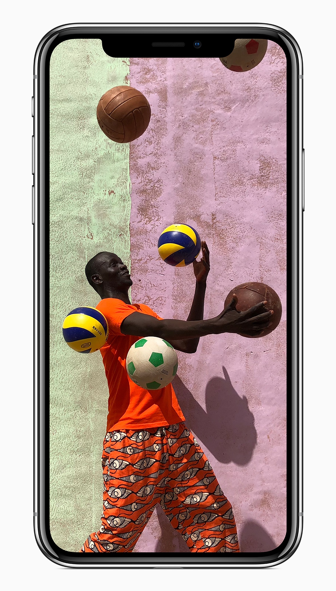
Last Tuesday Apple released their new (and expensive) iPhone X. The new phone has an “edge-less” display- something designers have been dreaming about for years! A phone where the actual device gets out of the way of the content you are consuming. It seems pretty magical. So the big question for designers is how will design change with the new, larger display?
More Display Area
First big thing is the size display area. The dimensions haven’t changed on the width, but the resolution has. Portrait designs need to be 1125px × 2436px (375pt × 812pt @3x). Landscape designs should be 2436px × 1125px (812pt × 375pt @3x).
As a designer, I’m excited for what this extra space is going to do visually. It’s really going to make the interaction with your apps feel more open and bigger. With photographs and images taking over the whole screen, it’s going to look beautiful!


Photos by Apple
Asset Size
There are a couple of things to keep in mind with with the new screen size and layout. The first is size of items on the screen. Photos on the smaller phones will get cropped on the top and bottom, so make sure nothing important is in the vertical space where it could be hidden on other devices like iPhone 8 or iPhone 8 Plus.
Interactions
Something else to keep in mind with the new iPhone X screen size is the placement of items on the screen. Be aware of your interaction tools and make sure none of your buttons are close to where the rounded corners will cut them off. The Home button is being replaced with an upward swipe action from the bottom of the screen. To avoid confusion and frusterating UX, keep the bottom of the screen clean from unique gestures.
You can checkout more details on Apple’s Human Interface Guidelines. I’m excited for the future of the iPhone and creating new designs for it. Are you?
Need an experienced iOS designer to take your design to the next level? Contact us today.
